FESTIVE | MOTD

20171227_174520.jpg

Christmas is over already, and I totally forgot to post a festive makeup look. I didn’t want to leave the opportunity to go a bit wild with glitters, so I want to share this look that is also perfect for New Years, but still a bit Christmassy. ( That Christmas is officially over doesn’t mean you have to throw out all the Christmas stuff)

20171227_174516.jpg20171227_174347.jpg

FACE: Loreal foundation, Maybelline Fit Me Concealer, Maybelline Matte Me Powder, Makeup Revolution Contour Palette, I Heart Makeup Blushing Heart Candy Queen of Hearts, Makeup Revolution Vived Baked Highlighter in Golden Lights

EYEBROWS: Catrice Eyebrow Powder and Eyebrow Gel

EYES: Catrice Eye Shadow Base and Maybelline Matte Me Powder

Palette: I Heart Makeup Wonder Palette in Chocolate Vice

  • Crease: Maleficence
  • Outer V: Need
  • Eyelid: Persuade
  • Inner Corner: Makeup Revolution Vived Baked Highlighter in Golden Lights

NYC Big Bold Mascara

LIPS: HEMA lipstick in 16 Red Velvet Cake

View this post on Instagram

Festive look🌟

A post shared by LIFE AS DAISY (@lifeasdaisyblog) on

View this post on Instagram

Festive makeup look. Soon on the blog! 🌟 #linkinbio

A post shared by LIFE AS DAISY (@lifeasdaisyblog) on

That’s the finished look! Enjoy the last days of 2017

xxx


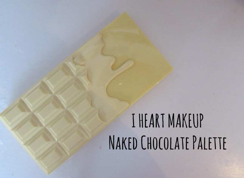
I HEART MAKEUP Naked Chocolate Palette | Review

iheartmaku

This palette is so adorable! Just look at the packaging, so cute how they made this chocolate bar. I’m owning this cute palette for a while now, and I figured it was time to review it on my blog.

IMG_5100.JPG

The I HEART MAKEUP Naked Chocolate Palette really reminds me of the Too Faced Chocolate Palettes. I believe I HEART MAKEUP is known for the Too Faced dupes. They also have these heart blushes and highlighters that really look like the Too Faced ones.

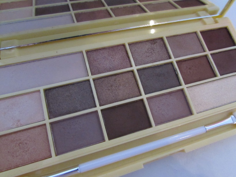
The colors in this palette are so lovel. All very natural, but also great to make a more smokey look. I also love how they put in matte but also shimmery colors.

IMG_5092.JPG

Smoothly – Divine – Mocha Lover – Dipped – Choc-fest

The first row of eyeshadow are very natural and shimmery, expect the first and last one.

IMG_5094.JPG

Adorable – Buttons – Frosted Choc – Delight – Sweet Shop – Sugar

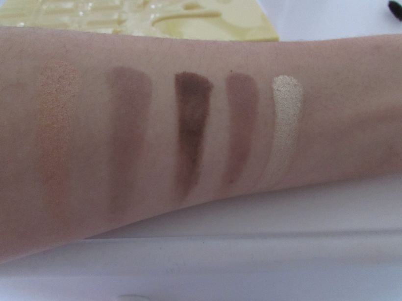
These colors are darker, and I feel like they also are more pigmented. Is that possible? Would be very strange actually. I’m really loving the color Frosted Choc. It’s so beautiful as a popping eyelid color. Most of the colors in this row are shimmery

IMG_5096.JPG

Double dip – ‘Tob-le-rone’ – Wonka – Milky – Way

The last row, most of the colors in this row are matte. It stands out that the matte colors are less pigmented than the shimmery colors. They’re still great, just a little less pigmented.

The palette is really lovely. The shimmery colors are beautiful and very pigmented and in combination with the matte colors you can make amazing eyeshadow looks. The packaging is adorable, and another advantage is that the palette is affordable. It’s only €10. It’s great!

Thank you for visiting, have a lovely day! xxx

Instagram ♡ Youtube ♡ Bloglovin’

MAKEUP REVOLUTION ultra contour palette | Review

IMG_4951.JPG

In a lot of my MOTD posts, I tell I use the Makeup Revolution Ultra Contour Palette for contour. (for example here, here and here) I thought it was time to properly write about the palette, as I use it almost everytime I put on makeup.

IMG_4957.JPG

This is what the colors look like, please don’t mind the quit dirty mirror and just everything. I have it for over a year now, and I also used it a lot. The palette contains 8 colors to contour and highlight. The first row are highlight colors. The first two are matte, pink toned and yellow. (reminds me of the banana powder). Honestly I barely use them, because I always use another finishing powder. Sometimes I use the yellow one under my eyes though, to make me look more awake. The two highlighters next to it are beautiful! I love the third one in the row the most for a natural glowy highlighter. It gives a lovely glow, but not like bam NikkiTutorials glow (love that though, but personally not for everyday). The other one is soooo pretty, that’s the one I use when I want a cool toned more shiney highlighter.

The second row are the contour colors. Actually I only use the second one, because I had the feeling that looks the best on my skin. Cool toned again. But after I made some swatches, I saw that the first and third are also quit fitting!

IMG_4959.JPG

Here you see the swatchs of the first row, the ‘highlight’colors. The pigmentation is great. Also the difference between the two highlighter is showable here.

IMG_4962.JPG

The contour colors! These also are very pigmented. The last color is a shimmery bronzy color. I think it would be lovely for a summer bronzed look!

wp-image-728771929jpg.jpg

On an everyday basis, I always try to keep my contour and highlight as natural as possible. Most of the times I use the third highligther. On the picture above you can see the contour and highlighter together. For me this was quit much contour.

I really love the palette. The colors are great for me, the pigmentation is very good and it’s also affordable. It’s only 10 euro! I recommend this palette to anyone who is looking for a affordable powder contour palette.

Thank you very much for visiting. Have a lovely day!

Instagram ♡ Youtube ♡ Bloglovin’

MOTD: Going Green/Grey

IMG_4739.JPG

Remember those days when people matched their clothes with their makeup. I was too young and didn’t wear makeup at that time, but I always tried to do this with nailpolish. Pink shirt? Pink nails it is!

I purchased this beautiful dark green sweater at H&M in sale and I was so sure of having the same color in eyeshadow. I already imagined it in my head, me wearing that sweater with dark green smokey eyes. As they say, dreams are dreams, not reality. Yes, because in reality it wasn’t what I imagined.

IMG_4752.JPG

This is the color we’re talking about. Too Faced even called it ‘Earl GREY’ so why I thougt it was dark green is a big question. In the pan it really looked like a very dark green in my eyes, but on my eyes it is so grey. Disapointment.

img_4737-2img_4755-2

I still tried to make something out of it, result: sort of grey smokey eye something. It doens’t show that good on camera, but I wanted to smoke it out a bit on the outside and a lighter color on the inner corner. I used the colors Earl Grey, Mocha and Satin Sheets from the Too Faced Bon Bons Chocolate Palette. A big wing and some mascara to finish the look.

IMG_4757.JPG

For the face I used the Catrice Even Skin Tone Beautifying Foundation, Maybelline Fit Me concealer, Maybelline Matte Maker Mattyfing Powder, Makeup Revolution Contour Palette to contour and highlight, Freedom Peach Blush Palette.

For my brows I used the Kiko Eyebrow Sculpt Pencil and the Catrice Eyebrow Gel.

On my lips I’m wearing Velvet Teddy by MAC. One of my favorite nude colors!

I combined the pretty dark green sweater with this cute demin overall dress, but there will be a post about that later on!

Thank you for visiting. Have a lovely day!

Instagram ♡ Youtube ♡ Bloglovin’

Freedom Blush Palette | Review

IMG_4667.JPG

The Freedom Pro Blush Palette Peach and Baked is a beautiful palette. I have it for a while now, but never really used it. ( Yet again this was a “ohmygod so cute I need this let’s buy this but totally forget about it”product, I need help) The only color I used is the shiny pink one in the middle because it is a sheer color.

IMG_4670.JPG

The palette contains 6 peachy blushes, one pink sheer glittery blush and one highlighter color. The 6 colors are really pigmented, and some are a little bit too orange, it shocked me. As I told in the intro, the pink sheer color is my favorite. The blushes feel really soft on the skin, and they apply very easily.

IMG_4672.JPG

These are the first three colors on the left. Sadly they don’t have names. But as you can see they are really pigmented and orange/brownie (well the last two). The two orange/brown colors aren’t really what I like, but the first pink/rose color is a beauty. Maybe I am going to wear that one more often.

IMG_4674.JPG

Here are the two colors in the middle. As you can see they aren’t as pigmented as the other colors, but I like that for a blush. I’m always scared that I end up with way too much blush on my cheeks and look like a clown. In my opinion, is the first one more of a highlighter and the second one is a beautiful sheer glowy blush. My favorite.

IMG_4675.JPG

The last three colors! These are more on the orange/pink/red side. Really love the first two, the last one is a bit too orange for me.

It’s a lovely palette, with a lot of different colors. It’s perfect when you love peachy blushed and when you are warm toned. Also, the price is very nice, only 7 euro! As I am more of a cold toned person, I could better go for the other blush palette by Freedom. But I still think it’s a beautiful palette, and I will try to use it more often!

Ps. for the Dutchies, here is the link to it on Boozyshop. It’s also available at Kruidvat.

Thanks for visiting and have a nice day!

Instagram ♡ Youtube ♡ Bloglovin’

Sephora Must-have Makeup Palette

pallet_20161227_0001

A while ago, when I was in Milan, I spotted the Sephora. Of course I had to visit, as we don’t have Sephora stores in the Netherlands. I did not really need something actually, but I bought this palette what Sephora called the Must Have Palette. Well as Sephora says so, I must have it right? So I bought it. May be handy for trips or vacations I thought. Well, it may be, but I wouldn’t know as I did not use it once since I’m home. (It’s been 5 months or so that I’m back home oops). Until now that I forced myself to finally swatch the colors, and I’m surprised!

pallet_20161227_0006pallet_20161227_0009

The packaging is very cute and girly with the pink tones. It looks like a little notebook. The size is very small and it is compact to take with you. There are four eyeshadow, a blush, a bronzer and a mirror inside. They also put in a description on how to use the shades in French and English.

pallet_20161227_0014

The eyeshadow colors are very natural, nothing crazy. The white and dark brown one are matte, the two others a glittery (very glittery). The blush and bronzer contain both glitters.

pallet_20161227_0015

Left to right: 1 Delicate matte beige, 2 Luminous gold, 3 Metallic taupe, 4 Intense matte brown

The pigment is great! The dark brown matte color is perfect for the crease, the white one for the brow bone and one of the glittery colors on the eyelid and you have a fun eyelook. Perfect to take with you on a trip or something.

pallet_20161227_0017

The blush is a beautiful pink, and also very pigmented wow. The bronzer is more gold, I don’t think this is a good color to contour or something. Maybe when you are already a bit sunkissed, that you can create a glow with this. But I don’t really like that bronzer, it’s too gold/orange/glittery.

pallet_20161227_0023

The first eyelook I created was with the colors 4 Intense matte brown and 3 Metallic taupe. I tried making a soft smokey eye. Using the matte brown as the dark color, more dark on the eyelid and blending it softer upwards with a little help of the color 1 Delicate matte beige to soften the edges. With the metallic taupe on the middle of the eyelid I wanted to create a pop of light, to make it less dark.

pallet_20161227_0026pallet_20161227_0035

The other look was supposed to be a more wearable look for day time. I used the Intense matte brown in the crease and the Luminous gold on the eyelid. But it became one big glitter eye. The luminous gold shade has a lot of fall out, so the glitters are everywhere.

For a natural matte look you can also use the matte brown in the crease and the delicate matte beige on the lid. But I wanted to try out the glitter eyeshadows for a more festive look. So this palette gives you the possibility to create 3 kinds of looks: a natural one, a silver party one and a gold party one.

The palette is fine. It has a great size for taking it with you and the little mirror is also handy. The colors are pigmented and good to make different looks. The only disadvantage is that they are very powdery and give a lot of fall out.The blush is also pretty, but the bronzer is too gold. Personally I wouldn’t use it. But the palette is great to take with you for touching ups or trips 🙂

The palette is available here. The site says it costs $18, but I believe I payed less for it haha.

Thanks for visiting!

Instagram ♡ Youtube ♡ Bloglovin’

Glitter Cut Crease

20161213_153107_001

In this post, I showed the Primark Glitter Palette. To be honest, I had not really used it yet because the quality wasn’t great. But today I decided to try to make a cut crease with the glitter palette and even though I have glitters on my face EVERYWHERE (help) I’m really content with the look. It was my first time creating a proper cut crease, and I’m happy with the result.

IMG_4459.JPG

For this look I used the glitter palette, a brown eyeshadow (the color I used is from the I Heart Makeup Naked Chocolate pallete) and a concealer to cut the crease.

IMG_4475.JPG

Here is a swatch of the glitter I used. In the pan it is a bit greasy, but it gets more glittery dry on the skin. The only problem is that the glitters smudge on the eye because of the warmth of your skin.

Step one

IMG_4463.JPG

I started with blending the brown eyeshadow in the crease. It does not have to be very precise, we are going to clean it up later. I also blende the edges with a white eyeshadow to make it less harsh.

Step two

img_4464

With the concealer we ‘cut the crease’. It’s the intention that the line is a bit more sharper, but hey first time, I still need practise. Also, don’t use to much concealer because when you use to much products this can smudge too.

Step three

img_4472img_4473

Last step: add the glitters!! As you see on the last picture, the glitters already smudges a bit when I blinked sadly.

To complete the look I added a coat of mascara, some brown eyeshadow on the low lashline an I cleaned the edges.

img_448320161213_153110

And that’s the finished look! The glitters make it really festive, so it’s perfect for Christmas or New Years. I did not add a lipcolor, but I would go for a red or a nude color. The eyes already get so much attention because of the glitter and I always like the ‘rule’: Or bold eyes or bold lips. But in this case I think a red lipcolor would look lovely!

Hope you liked it! Have a nice day 🙂

Instagram ♡ Youtube ♡ Bloglovin’


Cream Master Contour Palette by Primark | Review

20161107_170451

When I was in the Primark, I found this master contour palette. I really wanted to try this one, because the most cream palettes are by high end brands and very expensive. It was only €8, so why not.

20161107_170506

On the back of the packaging is a description on how you can use the palette. Very helpfull.

20161107_170527

The palette contains 1 glittery highlighter, 3 light colors and 4 dark/bronze/contour colors. I found the dark colors very warm, only one is suitable for contouring. Hmm

20161107_170653

Swatches of the highlight colors. They are kinda pigmented. Not bad but also not very good. But let’s not forget it’s primark! Oh and the colors don’t have names, according to the back they are all called ‘highlight’

20161107_170738

These are the contour colors. Again, just as the highlight colors, not bad but also not very very pigmented.

I also made an impression video about the palette! If you can’t see it, watch it here.

20161107_171735

This is the end result. Not very proud of it haha. The highlighter is very bright and glittery and the contour color is very hard to blend. But let’s not forget it could also be my blending and contour skills, still working on it!

Thank you so much for reading!

Instagram ♡ Youtube ♡ Bloglovin’